Forex Trading Basics

Forex Trading Strategies

Binary Options Trading

Latest Updates

Showing posts with label Making Money With Forex. Show all posts

Applying Risk Reward

7:44 AM


Applying Risk Reward.

Understand the Power of the Numbers Game!


Is Risk:Reward the Holy Grail of Strategies?


If you give risk:reward the thought that it deserves you will soon understand just how powerful of a role it can play. You will quickly understand how, all by itself, it could make or break you as a trader. In this lesson we will take a look at the numbers game behind risk:reward but before we do that it is also important to quickly review the power of what you have learnt so far.

If you are able to master your trading psychology and properly use the price action confluence of a solid location, chart patterns, market structure, entry trigger and market layers, your win rate will very easily be 70% or higher. There are VIP members here at ElectroFX.com who go months without a loss but this is not something you will be able to achieve overnight. You won’t know your win/loss ratio until you have been trading for a while but you will be able to determine it before you start trading live. Let’s take a look at how applying a risk:reward strategy to your trading plan can help you succeed no matter what your win/loss ratio is, this may just be the holy grail piece of your puzzle.


Use Simple Math to Your Advantage


Don’t worry if maths is not your strong point, there is nothing complicated about this. Let’s assume that you will always risk 2% of your account on every trade that you take. As outlined in the stop loss lesson; you can avoid the need to worry about different size stop loss’s on each trade by using a percentage risk. Not every trade is going to have the same size stop loss so this is a great approach if you want to eliminate the need to think about it.

In this following table we will base everything upon having taken 10 trades using different risk:reward ratio’s each time. Each example results in the same 4% profit for your trading account, yet each example has a different amount of trades won vs lost. 1:1 should always be considered as your minimum risk:reward requirement for any single trade. A 1:5 risk:reward trade is not something you will find very often but it does serve it’s purpose here as an example.


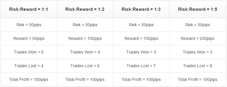
For those of you who prefer to view everything in pips instead of percentages here is another table with the exact same information. If you had a plan that allowed you to always limit your stop loss to the exact same amount of pips every time then you could look at it this way. Based on taking 10 trades this is how it would all play out for the same total profit.


The fact is that if you trade using the evidence based approach outlined here at ElectroFX.com then you do not get to decide what the risk:reward ratio on a trade will be. The strategies outlined so far will however allow you to understand what the risk:reward ratio on any given trade is, before you enter. In turn this means that you can decide what the minimum risk:reward ratio you will accept is going to be. If the trade setup that you are seeing does not meet that minimum then you just need to sit out and wait for the next one.


A Very Conservative Calculation


Earlier on in this lesson you were told that a 70% win rate is very realistic with the approach that has been outlined in these lessons. A higher win rate than that is very possible so let’s assume a lower win rate to be conservative. Based on only ever winning 60% of your trades here is another look at those same risk:reward ratios to compare the outcomes.


By always winning 60% of the trades that you attempt you can see the mathematical advantaged that a risk:reward strategy can provide. It’s not complicated, but it is powerful, and it should play a part in your complete trading plan.


Finding Your Risk:Reward Balance


Flipping a coin would give you a 50% chance of getting a trade correct. The whole purpose of you studying right now is to top the scales further in your favor than that. Knowing that it is realistic to achieve a 70% win rate, that some traders can go long periods of time without a loss, and that flipping a coin gives you a 50% chance, why not assume that with the correct knowledge you can achieve a 60% win rate. Based on that 60% win rate; if you have a minimum 1:1 risk:reward ratio as a rule then you are keeping that small advantage knowledge has given you. That 1:1 is just a minimum though and you will also get the odd 1:2 and even 1:3 risk:reward trade, pushing things even further in your favor.

If you progress along with your trading and notice that you are only winning 50% of your trades, make a small adjustment. Your minimum risk:reward rule on any one trade could be changed to 1:1½ or 1:2. That would make winning 50% of your trades profitable and you could always adjust it again later on once your win/loss rate improves.

Take Profit Projection

6:40 AM


Take Profit Projection.

Determining the Probable Future!

Predict the Future Based on the Past


You need a proper strategy for judging take profit and this piece of the puzzle basically means predicting the future. Fortunately the Forex market is a creature of habit and history tend to repeat itself. Furthermore, historical price movement allows you to assume the most probable future based on your trade being correct. This is all you can do as a trader, assume that you are correct and work with the most probable outcomes based on whatever proof you have at hand. In the previous lesson you were shown how to use a stop loss in case you are incorrect so the safety net is in place. Let’s now take a look at all of the different pieces of usable information that you will have access to before you enter any trade, and how you can use that information to your advantage.

Trend Continuation Buy Targets


Getting back to our first example we have the trend continuation trade. Whenever you enter a trade you will do so because you believe that you are correct, otherwise why would you be entering? So with that in mind there are two simple techniques that you can use to help judge where your trade will most probably reach. The first is as simple as using support & resistance and supply & demand areas which you can look at as obstacles. The second is to gauge the momentum behind your trade using the latest highs and lows that are being made.


When it comes to the horizontal obstacles in your trades path, the most conservative target is always going to be obstacle 1 and a slightly more ambitious target is obstacle 2. Taking the middle road and shooting bang smack in the middle of them both is also a very solid option. If you then apply momentum you can see make sure that all three of those options appear to be likely. If you target the edge of the predictive momentum you will be pushing the most ambitious and greedy target and it is not advised. It may have worked out in this particular trade but what you want is to be consistent rather than get the odd big win.

In order to help you understand how to plot momentum there is an a, b, and c marked on the above screenshot at the highs and lows that would be used. These are the latest pieces of information that you can use. Points a and b are permanent highs and lows that are indisputable at the time of your trade entry, point c is not yet a confirmed swing low at the time of your entry and it is your trade being correct that will make it one. Point c gets used because you are assuming that you are correct, remember? why else would you be entering the trade in the first place!

Double Top Sell Targets


Our next example is the double top which presents a slightly different scenario. Due to the nature of this pattern there is no real momentum and obstacle 2 is the momentum line itself. Obstacle 1 takes in to account all of those spikes on the candles that created the previous low (point b) and safely targets above them.


The conservative target here is obstacle 1 just as it was in the previous example, this whole concept is rinse and repeat so that part never changes. The more ambitious target is obstacle 2 which is also the momentum line and a safe play is right bang in the middle of it all. In the previous example you were following higher highs and higher lows so you could expect more of the same. In this example we have a double top to fight the uptrend so although you can expect a slightly lower low it is much safer to assume a slightly higher low.

Momentum was plotted the same as before, points a and b were permanent fixtures at the time of your trade but point c was not. At the time you would be taking this trade point c would be a prediction based on you being correct and that is why it is used.

3-Point Turn Buy Targets


Our last example is the 3-point turn which is also the break of the double top highs and back to following trend. A higher high can be expected and obstacle 2 in this trade is actually off of the screen. Obstacle 2 is exactly where the arrow indicates and if you want to take a look you will need to bring up a GBP/USD daily chart and look at 2011.08.23 to see it.


In this example you can see just how greedy and unsuccessful targeting the momentum line would have been. Try to only use the momentum line to gauge how probable obstacle 2 is vs obstacle 1, or vs the middle ground of the two. The momentum line was plotted the same way using permanent points a and b along with the assumed point c like before.

You Now Know Your Potential Reward Before Entering


You are now at a powerful position where you know how to intelligently choose your trades based on proof, and also how to judge your stop loss (risk) and your take profit (reward). In the next lesson we will look at just how important understanding risk vs reward will be for your trading career.

Stop Loss Protection

6:31 AM


Stop Loss Protection.

Protect Your Account on Every Trade!


The Purpose of Using a Protective Stop Loss


The first reason for you to use a stop loss on every trade that you take is quite simply to protect your account. If you trade intelligently in a way such as has been outlined so far you will have a ‘price action reason’ for where you place your stop loss. There will be a chart pattern at a great location that once entered will have an obvious failure point where you are wrong. You will see exactly what is meant by that in this lesson.

The next reason to use a protective stop loss is because it will define your risk and this is information that you can use. Before you even enter a trade you need to know your risk so you can compare it to your potential reward. This piece of the puzzle will be clarified in a later lesson about risk vs reward.

Stop Loss Placement Without Layers


Using our 3 recent examples we first examine a stop loss placement strategy without using layers. You will then be able to compare this against how things are done with layers further down this page. This will then also help you with your understanding of the reasons behind the strategy itself since they both follow the same concept.

Trend Continuation Buy


In this first example of the trend continuation you can see that we are trading the mirror flip support & resistance location. This mirror flip made into a clear visual thanks to the green swing line and the support & resistance box. Furthermore this box was already re-tested by the next layer of price movement down which created the area of demand marked by the first X. This essentially involves a second layer without mapping one out on the chart. It does however help us pinpoint the exact area that we are trading giving us a pinpoint place for our stop loss.


The idea here is that we can see where there was previously order flow and have returned to it, the chart patterns are looking good and so is the location. If price however were to break the price that is the first X on the above screenshot, then our analysis would be wrong and therefore there is no point in holding the trade any longer. Allowing a few pips buffer on your stop loss is always a good idea but there is no need to allow price to break that first X by very much.

Double Top Sell


This next example is the double top trade and here the location was inherent in the chart pattern itself. The area that we are trading is given a clear visual thanks to the green swing line and the resistance box. The location was created by that first green swing of selling down and marked by the first X on the chart just below. As the entry trigger forms at the retest of that same area, marked by the second X on the chart, it is clear which area we expect to hold and therefore we have a pinpoint place for our stop loss.


The idea remains the same, we can see where there was previously order flow and have returned to it, the chart pattern and overall market structure looks great and so is the location. If price were to break the high that is the first X on the above chart then our expected chart pattern would no longer be valid. This would make our analysis wrong and there would be no point holding the trade any longer. A few pips buffer on your stop loss would be a good idea but there is no need to allow price to break that first X by very much.

3-Point Turn Buy


The next example was the 3-point turn which was also a trend following mirror flip location of the double top highs. Just like our first example the image below essentially involves a second layer without mapping one out on the chart. The area of demand, marked by the first X on the chart below, helps try to pinpoint a place where order flow in the correct direction started last time price was here. This gives us an area that we expect to hold and therefore a place for our stop loss.


The theme continues and we are trading the retest of an area that has already proven itself. The chart patterns and structure look good along with the location. If price were to break the low that is at the base of the first X on the above chart then we may be wrong in our analysis. There would be no point holding the trade any longer but a buffer of a few pips would be wise. This trade is very much a trend following setup that is also a high/low breakout style trade that is also taught here at ElectroFX.com. This type of setup does allow the choice of just using the second X as your stop loss but you will learn about that later on if you decide to continue your studies here.

Stop Loss Placement With Layers


When using layers the concept does not change at all but the information that you have to work with does. You will still justify your location in the same way as before but when it comes to the stop loss things are slightly different. Without layers you were following the idea of a location being created, then a location being retested and confirmed by the entry trigger. The stop loss was simply going two peaks back from those two reactions. Nothing changes with the idea but now with layers you have a faster way to look at what is two peaks back.

Trend Continuation Buy


Our first example of the trend continuation has no change in how you determined good location and what type of trade you are in. The addition of an extra layer here though shows you a 3-point turn type of reaction accompanied by an entry trigger. Following the same stop loss concept on a smaller scale, two peaks back is now a little different but still relays the same type of proof that you can use and react too.


In the above image you can see how two peaks back on the new layer effects how you see your stop loss. In the case of this trade the use of layers makes little difference to your stop loss but the concept should be getting clearer for you now.

Double Top Sell


This next example of our double top shows you again what was just outlined for you. The reaction and retest of the area you are trading is much closer together but the location and type of trade is based on not trading with the extra layer. The two X’s on the below screenshot give you a visual on what is now two peaks back.


Just like the previous example of the trend continuation there has been no real change in your stop loss for this trade. It is looked at a little differently but your end result stop loss price has barley changed. The use of layers here just helped you with pinpointing which entry trigger to use and gave you more proof to work with.

3-Point Turn Buy


Our last example is the 3-point turn after the break of the two double top highs. Things are slightly different here but the concept remains unchanged and repeatable. There are two choices when reading your stop loss placement on this trade and both are perfectly OK. You can go two peaks back on the black swing line as we have been doing so far, or you can observe the upside down head and shoulders pattern and realize that is the area you are trading.


Using layers on this trade changes your options significantly both for entry triggers to use and stop loss placement. The great thing is that all of them work out because the chart patterns, location, and overall market structure was all on your side. The power of trading based on visible proof should not be underestimated.

Stop Loss Size Doesn’t Have to Matter


A quick tip to wrap up this lesson is about your stop loss size because many people do get all wrapped up in it. The fact is that if you trade in the way outlined here at ElectroFX.com you will always know the size of your stop loss before you enter a trade. This means that you could risk a percentage of your account based on the size of that stop loss, which in turn means that the size of your stop loss doesn’t matter. The only thing that should matter is basing all of your decisions on proof and making sure that you never risk more than you are trying to gain. In the next lesson we will look at how support & resistance, chart patterns, and the overall market structure can also be used to determine where the best take profit will be. Knowing your risk vs reward pre-trade is a very powerful tool.

Using Market Layers

7:57 AM

Using Market Layers. 

Traders Battle on Different Scales


So Many Traders, So Many Styles


With so many different types of trader and so many different trading styles it is no surprise that the Forex market has many layers of price action at play. If you learn to read these layers then you can add that to the price action confluence you look for, and in turn also add to the probability of your trade working out. To avoid repeating the complete basics if you need a quick introduction to where I will now pick up from; re-visit this article here if you need to.

In an attempt to keep these initial lessons simple we have been using the daily chart. We have used a green swing line to represent the scale at which we wanted to trade. It has been 3 of those green swing movements that have been the study of your introduction to Forex trading strategies. Due to the power of the daily candle as an entry trigger, the use of layers is not as important as it is when you speed up your time frame. They are however still applicable and this will serve as your introduction on how you would use them.

Entering the Trend Continuation Buy with Layers


Since we are trading what is represented as the green swing on our chart examples, we must look for a scale of price movement that is below the one we are trading in order to use it. Some may prefer to do that by having a 2nd chart open on a slightly faster time frame, you will understand that in the free video course here at ElectroFX.com. It is however also possible on just the one chart and this is what we will do for now and for the sake of simplicity. In this next image a black line has been added to represent the next scale down of price movement relative to the green line we are trading.


This black line displays a faster scale of the buying vs selling war and it’s time to re-use your knowledge of chart patterns. In the previous lesson there were 3 candlestick entry triggers that you would have had your eye on to enter this trade, with the use of layers there is clearly only 1 candlestick entry trigger that you would be interested in. Let’s quickly review our entry trigger mechanism now including this concept.
This indecision candle reacts exactly from the upside down head and shoulders area marked with the X.
It is also at the turn of what will be the 3-point turn on the black scale of price movement / swing.
All we need now is to pass its high on the next candle which does happen and that is your entry price.

Entering the Double Top Sell with Layers


As we move on to the double top and apply the exact same concept you will see the next relative scale of price movement mapped out by the black line. Just as before some of you may prefer to do this on a 2nd chart running on a lower time frame. For the sake of page space and simplicity we will stick with one chart for now.


The black line brings back the use of chart patterns to help you understand the turn and choose the safest candlestick entry trigger. In the previous lesson there were 3 candlestick entry triggers that you would have had your eye on to enter this trade, with the use of layers there is clearly only 1 candlestick that you would be interested in. Let’s quickly review our entry trigger now mechanism including this concept.
  • This indecision candle reacts exactly from our chosen area confirming that it is active.
  • It is also at the turn of what will be the 3-point turn on the black scale of price movement / swing.
  • All we need now is to pass its low on the next candle which does happen and that is your entry price.

Entering the 3-Point Turn Buy with Layers


Our final trade to review with the addition of layers introduces a different situation. The original entry trigger from the previous lesson is not in line with our new layer and so the entry may have been missed. The use of layers though provides a different entry trigger opportunity with more proof attached to it.


In the previous lesson there was an entry trigger at a great location but here it is not yet inline with the black layer that we have added. Once the 3-point turn starts to presenting itself on the black line there is another indecision candle to use as an entry trigger. Let’s quickly review this new entry based on the inclusion this layered concept.
  • This indecision candle forms at what will be the 3-point turn on the black scale of price movement / swing.
  • Location is still good based on the split double tap of the area marked X.
  • The previous high on the black line pierced the previous high on the green line signalling intent to push up further.
  • All we need now is to pass its high on the next candle which does happen and that is your entry price.

Food for thought:

If you did take the original entry trigger from the previous lesson, this new entry trigger based on layers could have been used to add to your position. Hmmm.

More Price Action Confluence, Entry Trigger Add-on


In the previous lesson we covered entry triggers and in the one before that we covered price action confluence. The use of market layers simply adds on to both of those pieces of the puzzle but does remain optional at the daily chart level. The lower the time frame the more valuable the use of market layers can be, and as you can see they can still be very effective even at the daily chart level.

Price Action Confluence

1:43 PM


Price Action Confluence

Bringing the Pieces Together


Pieces of a Puzzle That Fit


In order to inject you with this knowledge slowly we will now take a look at how the previous 2 lessons connect together. It is this price action confluence that will allow you to trade very safely and based on evidence. You will never be able to continuously win every trade you take no matter how good you get, but you can keep those probability scales tipped handsomely in your favor.


Trend Continuation – Great Location


Starting with our first trade example of the trend continuation let us use an image to visualize the price action confluence behind it. At this stage in your learning it is important that you properly understand how each concept is working for you, and also how each concept is slotting together.


There is a lot of price action confluence going on with this trade and all tipping the probability scales in your favor.


  • There is a confirmed higher low followed by a confirmed higher high (very clear in the wave structure),you plan to be part of the turn that will be the next higher low in the sequence.

  • There was an area of resistance that is now acting as support (the squares in the above image),this is what is referred to as a mirror flip and at the support/resistance level location looks good.

  • There was an area of demand that was also created and is now being retested (the circles in the above image),this can only be seen as a big plus adding more probability to an already good location.

Double Top – Great Location


The next trade example we had was the double top so let’s visualize the price action confluence behind it. If anything is leaving you scratching your head at this stage then you may need to quickly review the Forex trading basics section.


Once more, plenty of price action confluence at play, but with the double top location is also inherent in the pattern.


  • There have been 4 pushes up since the move began at the bottom of the chart (very clear in the wave structure),you plan to be part of the turn that will confirm that a top has been reached and it is time for a reset.
  • There was an area of resistance created and is now being returned to (the squares in the above image),this is where you look for a retest to begin so that you can be part of the double top pattern.


3-Point Turn – Great Location


The next trade from our chart was the 3-point turn after a reset in the upward momentum. In order to visualize all of the price action confluence at play let’s first look at the following image.


By now the price action confluence in this image should start to stand out for you.


  • There is a confirmed higher high after the break of the 2 double top highs (very clear in the wave structure),

you plan to be part of the turn that will be the higher low in the 3-point turn sequence.

  • There was an area of resistance that is now acting as support (the squares in the above image),

this is what is referred to as a mirror flip and at the support/resistance level location looks good.

  • There was an area of demand that was also created and is now being retested (the circles in the above image),this can only be seen as a big plus adding more probability to an already good location.


Only Thing Missing is an Entry Trigger!


Chart patterns, market structure, and location can be used as a unit but there is one more connecting piece to the trade entry puzzle. You need to define yourself an entry trigger to confirm you are not alone in your analysis, a way to prove that the majority of those who actually move the market are on the same page as you. Technically this is also in the price action confluence category but it deserves it’s own lesson and that comes next.

Read the Chart Patterns

4:13 PM


Read the Chart Patterns

Understand What Type of Trade


Chart Patterns and Market Structure


Chart patterns were introduced to you in the Forex trading basics section, they will now help you understand ‘how’ price arrives at these areas of support & resistance and supply & demand from the previous lesson. They awill also help you understand what type of trade to expect and therefore also help you judge a probable take profit point. In this lesson we are now going to just use the current market history to explore just that.

To start things off here is an image of the GBP/USD at the time this lesson is being written. A swing indicator has been placed on the chart to help visually map out the chart patterns and the market structure. Consider this tool like training wheels on a bike, they can be helpful for learning but not so necessary later on.


You should be able to see the chart patterns in that structure and therefore the types of trade that were available. We will now take a look at a few different types of trade that happened at great locations within this current market history.

Trend Continuation for Buying


Starting at the bottom of our GBP/USD chart there is a nice simple trend following pattern, you can see the wave that you would want to be trading from the arrows in this next image. Your knowledge of chart patterns from the Forex basics section of this website should mean that you remember what type of trade this is.


The final wave of this pattern is of course the one that you would want to be part of. The location of that final turn should make complete sense to you at this point but we will take a look at that in the next lesson. For now let’s just focus on the chart patterns of the last 3 different types of trade that were available in this recent history.

Double Top for Selling


The next and very different trade that we have on our chart is a double top pattern for selling. Once again you can see the wave that you would want to be trading from the arrows in this next image. You should recognize this pattern.


The final wave of this pattern is your trade and the location of that final turn is inherent within the pattern itself. We will take a look at it again though in the next lesson as we bring all the pieces of the puzzle together.


3-point Turn for Buying


The next available but different trade in recent history is technically a 3-point turn after a directional reset. In this next image the reset is defined by the double top and following lower low. The black square shows you where this has happened. After that reset in the directional move upwards price raced up and broke the 2 highs that were the double top, then formed the 3 point turn to push higher. This is very similar to the way you would view a range breakout style trade.


As always it is that last wave of the pattern that is your trade. The location element should be obvious to you by now but we will revisit all 3 of the above trades in the next lesson

Forex Trading Strategies

9:54 AM


Forex Trading Strategies 

Successful Forex Traders Have a Plan!


Build Your Forex Strategy the Right Way


In order to start trading Forex successfully you will need to build a strategy that is so complete you don’t have to think too much when trading live. There is no point sitting there second guessing yourself and trying to make a decision when you are in a trade. You should already know how you are going to react to every possible scenario because you had spent the time considering them. This may sound like a tall order but once you are done with all of the lessons in this section you will see that it really isn’t.


Think about it; your only options are to buy or sell, the market can only move up or down, and the market will trend upwards, trend downwards, or consolidate in a range. When the market does change direction there are only so many ways that it can present itself. It’s actually all very logical and the hardest thing for any Forex trader to master ends up being the psychology of it all.


A Series of Strategies Create a Complete Plan


A complete Forex trading plan is made up of a series of strategies. You can break down the actions of trading in to the important pieces, trade location, entry trigger, and trade management. Each of those pieces will need its own strategies that are able to provide answers to all of the questions below.


Here is a list of the bare essentials that you would need to consider to take a any trade intelligently.


  • What needs to happen for you to enter a trade?
  • Why would you consider buying or selling in a particular price area?
  • What would be sufficient evidence that you are not alone?
  • When will you pull the trigger?

  • How you will handle the risk:reward element?
  • Where will you put your stop loss and why?
  • What will your take profit be and why?
  • What is the minimum risk:reward ratio you will accept?

  • How will you manage the actual trade once you are in?
  • When will you move your stop loss to break even?
  • Are there any situations that may warrant moving to break even sooner?
  • Will you use a trailing stop and how?

  • What will your lot size and account management be like?
  • What percentage of your account will you risk on each trade?
  • Will you consider some trades more probable than others and risk more?
  • Will you consider some trades less likely than others and risk less?

All of the above questions can be answered with a handful of price action based Forex trading strategies. It is all of those strategies that combine to make you a complete trading plan. This plan will enable you to successfully trade several types of trade and also give you a blueprint for adding more later on if you need them.


This series of lessons will show you Forex trading strategies that answer all of the above questions and show you several types of trade to expand on it all even further.

Forex Trading Psychology

9:30 AM


Forex Trading Psychology


Discipline, Patience, Confidence, Fear, Greed and Anger


Understand the Role of Trading Psychology


As a beginner you will probably be thinking that learning all of the technical stuff is the hard part, but if we were to fast forward 5 years, and assume that you are a successful Forex trader, you would have very different beliefs. The truth is; the hardest part about becoming successful at trading Forex is fine tuning your brain to cooperate.


As we all know and are constantly reminded everywhere, 90-95% of traders fail. There are plenty of good trading methods out there that work (some better than others), yet 90-95% of people fail. Some of those statistics will be the gamblers who don’t know what they are doing and weren’t interested in learning properly anyway, many of them were probably tricked with get rich quick claims and don’t actually realize they are gambling. We must assume that the rest of the people that fail are those who studied and understood Forex trading and wanted to pursue it, after all, if you studied it and didn’t understand then you wouldn’t bother continuing would you?.


So, with all of these people who understand Forex trading still failing, how can we break that group apart?. Some of this group would have to be those who didn’t quite look around enough and received bad education, the rest would be those who received good education and studied it well. This last group of people still have a high failure rate! Since you are reading this and taking the time to study then this is the group you will most likely be in. Assuming that you do go through all of material that you need to, develop and understand a complete trading plan, and prove to yourself that it is profitable before going live, we need to address the reasons for the continuing high failure rate after that.


Discipline, Patience and Confidence


Discipline and patience are required if you want to learn how to develop a complete trading plan properly in the first place. It won’t happen overnight and is a lengthy process, plus you won’t be earning any money from it. It’s easy to rush things and jump in before you are ready because you smell the money, it’s not so easy to maintain the discipline and patience required not to. Once you make it passed that phase you will then need more discipline and patience to test your plan properly and make sure that it works. This will also take a fair amount of time and the smell of the money will be stronger because you now have your plan. The discipline and patience to get through this phase does come with a reward though. By taking the time to properly test your plan and see it working you will build up your confidence in it. This will be very important for you later on when the emotions of trading real money come in to play.


Fear, Greed and Anger


Once you complete your trading plan and test it the next progression is to start trading with real money. Logically this should be no different from when you were demo trading but you will find that it is not. Emotions are important for real life or we would all be cold and robotic but you need to switch them off when Forex Trading. The biggest problem for most people is the fear of loss and there are a couple of ways to tackle this. Firstly, you shouldn’t be trading with money that you can’t afford to lose, and secondly, you should maintain the discipline and patience to build confidence in your trading plan as discussed above. Just try and keep a level head with your confidence as you see your plan working or greed may take over. The fact is; no matter how good your plan is there will be loss sometimes, getting greedy and loading up on a trade that results in a loss will make you angry. Anger will force mistakes and you could get on a very ugly path to destroying your whole account. If your trading plan accounts for loss as it should then there is no way you could know which trade will be one of those losers. This should in turn combat greed.


Forex Trading Psychology Tips


It is easy to read about and acknowledge all of this but some of it is unavoidable. Maintaining the discipline and patience to develop your complete trading plan, then build confidence in it, are the easy parts because they can be taught. Dealing with the emotional effects of trading with real money will be a slightly different journey for everyone. I’m afraid you will need more discipline and more patience to get through these emotional elements. Just remember the following points.

  • A complete and properly tested trading plan will build your confidence in it.
  • The more confidence you have the quicker you will master your emotions.
  • Never trade with money that you can’t afford to lose and fear should not be an issue.
  • You plan should account for loss so greed should not be an issue.
  • You plan should account for loss so anger should not be an issue.

Whatever you do don’t expect perfection from yourself, no matter how much you read or how smart you are you will make mistakes early on. The only question that remains is; will you keep making them or learn from them?

Support and Resistance

9:12 AM


Support and Resistance

Supply and Demand


Supply & Demand or Support & Resistance?


As you explore Forex trading you will hear talks about supply & demand that are just like discussions about support & resistance. This is because in all reality they are the same thing but you will find that support & resistance is more commonly used and related to technical analysis, whilst supply & demand is more commonly used and related to fundamental analysis. That said; over the past few years supply & demand does seem to have become slightly more prominent verbiage in the world of technical analysis. Here at ElectroFX.com we have made use of both references and you will learn how in this lesson as they are each used for a purpose.


We are now at the heart beat of how the Forex market moves because this piece of the puzzle is governed by the laws of supply & demand. Price will bounce around between these areas and create new areas as it progresses until the end of time as we know it. You can look at each new area of support & resistance as an area where, when revisited, price may potentially stall and sometimes even reverse. Let’s take a look at how these areas of support & resistance are created.


Recent Support & Resistance


The reason that you were introduced to chart patterns first is that recent support & resistance is inherent within them. If you have understood correctly how to read chart patterns then you already know how to read recent support & resistance, you just didn’t realize it yet. Let’s dive in and take a look at how it works starting with the trend continuation pattern.


As price swings up and down creating this trend continuation pattern it leaves support & resistance areas in its wake. When price swings down due to selling then it leaves behind an area of resistance. When price swings up due to buying then it leaves behind an area of support. When an area of resistance is broken it must be watched from the other side in case it will now act as support. Here at ElectroFX.com we call this the mirror flip. Naturally this applies both ways and if an area of support is broken it may then act as resistance.


In this next image we will look at a double top in order to understand this support & resistance concept further. This double top pattern is followed by a continuation scenario that often plays out.


In the first image you were able to see a visual of how the mirror flip works for resistance becoming support. In this image you can see the other side of that coin with support becoming resistance. The idea of support & resistance should be very easy for you to understand after your lessons on chart patterns.


Just to be thorough in your introduction to support & resistance let’s take at these areas mapped out on a range pattern.


These areas of support & resistance have now reached triple tap status and once broken are more likely to have a powerful move. The same applies to the triangle situation which is also part of the consolidation family.

Recent Support & Resistance Layers


Sometimes the market will set-up exactly as those previous images on this page but there are plenty more variations that can occur. If you want to increase the amount of trades you are able to take then you will need to apply the same concept of ‘market layers’ to how you are reading support & resistance.


Here you can see the same trend continuation pattern that we just reviewed only now the mirror flips are not holding. How these higher lows are still holding though should look very familiar to you as it has already been introduced to you before. Remember the 3-point turn and how the double tap element was achieved as layers were introduced? This is now what we are doing with support & resistance. In order to keep the image clean and focused only the minor support areas that could be used have been marked in. These minor support areas are helping you find probable locations for the higher lows that follow the higher highs.


Let’s now jump back to the double top example only a slightly different variation. In this next image you can see how the same idea is now applied to resistance instead of support.


Once again only the minor resistance area that would have been used is marked in. With this example the minor resistance area helps you find a probable location for the lower high to follow the lower low.


You should now be piecing together chart patterns, market layers, and support & resistance as a unit. Here at ElectroFX we just call those minor areas supply & demand areas to differentiate between the layers. The areas created by the fatter black line would be the support & resistance areas, and the areas created by the thin black line would be supply & demand areas. This is not necessarily technically correct and nor does it matter, this is just a way that we use the various verbiage available to communicate with one another.


Not So Recent Support & Resistance


If you are just keeping things simple for now then reading 2 layers of chart patterns with their inherent recent support & resistance will be enough. As you progress though you will need to consider the not so recent areas of support & resistance. In this next image you are looking at what is essentially the next layer up, there is only so much room on a page and this is as far back as can cleanly be shown. There will be times though that the next area of support & resistance is much further back than this.


Keeping in mind that what is recent to you is relative to what kind of scale you have chosen to trade, all of your recent support & resistance activity is inherent in the chart patterns. There are however occasions where price is heading in to new price areas that have not been visited for a long time. In those situations if you want to know where the next potential area of support & resistance is you just need to look above and to the left of current price, or below and to the left of current price, as far back as you need to. With free membership here at ElectroFX.com you will find software that draws all this in for you but for now this is your introduction. As you go beyond basic training you will learn more and more about reading support & resistance as a key component to your success.

Forex Market Layers

11:00 AM


Forex Market Layers

Reading Chart Patterns on Multiple Layers


There are Layers to the Forex Market


The Forex market is a global market that runs 24 hours a day for 5 days of the week. Among the participants there are scalpers, day traders, swing traders, breakout traders, and position traders. Even with swing trading alone there are different groups of people swing trading different time frames. If you combine all of that with the governments trying to control their currency, the central banks trying to control inflation, and large corporations just going about their daily business, it’s not hard to comprehend how the Forex market can have layers.


While not entirely impossible it would be way too complicated for the average technical analyst to follow all of these layers. In fact, all you need to trade intelligently is to follow 2 layers so that you can properly read all of the chart patterns that have been outlined so far. If you wish to add a 3rd then you should only do so after you have mastered trading the 2. So let’s take a look at how to read 2 layers and if you wish to extrapolate from that you will understand how to add a 3rd.


Using 1 Chart to Read 2 Layers


It is the belief here at ElectroFX.com that the easiest way for anyone to understand this concept is by using a price based chart. The type of chart that has proven to be the smoothest and therefore clearest of them all is the median renko chart. Without scrolling around and trying to find you perfect examples like at many websites, let’s take a look at what is happening right now as this lesson is being written. Here is the GBPUSD median renko chart set at a value that closely represents the 4 hour candlestick chart and with 2 layers of the market mapped out for you.


Applying your analysis to 2 market layers means that the slowest layer you are watching (the green layer in this image) are the moves that you really want to be trading. Chart patterns can then be used on the fastest layer you are watching (the brown layer in this image) to help confirm the direction change of the slower layer.


For most of you this is not a common type of chart. This next image is of the 4 hour candlestick chart so that you to compare something that is probably more familiar. Both of these charts have the exact same start dates and this is purely just a different way to display the same data.


Using 1 Layer to Trade the Other Layer


Now that you have had a visual representation of reading 2 market layers you should be able to see how chart patterns can be used on both. On the slowest layer you are watching you can use the chart patterns to understand what type of trade you are taking. On the fastest layer you are watching you can use the chart patterns to actually trigger the trade.


Trade A:


You slowest layer (the green line) is displaying a 3-point turn pattern and that tells you what type of trade you are taking. Your faster layer (the brown line) is also displaying a 3 point turn pattern and that gives you a confirmation of probable direction change. There is a mirror flip double tap element to this trade at the green line scale but it is just off the screenshot to the left. Don’t worry, there will be plenty of examples showing this type of double tap in the rest of the material here at ElectroFX.com. Just focus on the concept right now.


So, at the green line scale you will be part of the wave that will be the 3-point turn pattern once it is complete, and at the brown line scale you are trading the 3-point turn pattern as a whole to confirm the direction change of the green line scale. There is a double tap involved at the green line scale so you know that this price area had order flow in the past, and even at the brown line scale this price area has proven that it is once again active (You could have even traded the brown double bottom earlier on but we won’t overload you just yet).


Trade B:


You slowest layer (the green line) is displaying a trend continuation pattern and that tells you what type of trade you are taking. Your faster layer (the brown line) is also displaying a double bottom pattern and that gives you a confirmation of probable direction change. There is a mirror flip double tap element to this trade at the green line scale that you can see just to the left. This is too easy right? Don’t get too cocky because you haven’t met trading psychology yet!


So, at the green line scale you will be part of the wave that will be the trend continuation pattern once complete, and at the brown line scale you are trading the double bottom pattern as a whole to confirm the direction change of the green line scale. There is a double tap involved at the green line scale so you know that this price area had order flow in the past, and even at the brown line scale it has it’s own double tap built in.


Adding a 3rd Layer


If you are comfortable with this concept you can add a 3rd layer by simply extrapolating from what was explained so far. The beautiful thing about this concept is that the same idea applies to each layer and there is nothing new to learn. It is strongly recommended that you master 2 layers before adding a 3rd for for the sake of clarity let’s take a quick look.


When using a 3rd layer you could use a faster chart to simply use chart patterns once again, or you could use candlestick / bar patterns for entry. The spots marked X on this image show the time that you would be able to consider looking for a faster way in. Let’s not complicate things too much at this stage though, this is still basic training.

Chart Patterns, Part 3

9:08 AM

Chart Patterns - Part 3

 Triangles & Ranges


Chart Patterns for Sideways Markets


That last types of scenario that can play out in price will form during consolidations. This is when the market has no immediate direction, or trend, and instead is moving sideways. There are only two distinct ways that this can happen and we will take a look at both in this lesson.


When the market finishes trending, or wants to take a break before continuing, it will show on your chart as a sideways movement. This is kind of like a ball dropping from height only gravity can also be reversed and so it could also happen upside down. The two ways that this can happen would be like a basketball vs a bouncy ball.


Triangle Patterns


This first pattern would be the basketball that has a good first bounce but then slowly looses its spring.


It is consecutive higher lows and lower highs that define this pattern. If the higher lows and lower highs that are being made were very close together then up to a point you may still be looking for a split double tap pattern, try not to mix them up. This pattern can be traded once price picks a direction and gets out of the triangle. The only safe way to do that is by allowing it to break out, waiting for the pullback, and using the double tap concept in a slightly different way.


Some traders will simply wait for price to break out of the triangle and jump in to to a trade. Here at ElectoFX we continue on with the repetitive theme of a double tap, in this case though you can use a mirror flip double tap, you just need proof that orders existed a price point on order for history to repeat itself. In order to do this you can wait for price to leave the triangle and return to it from the other side, you can see the 1-2 punch in the images above and would want to be be part of either the angled dotted colored waves, or the break of horizontal dotted colored waves. Look familiar? it certainly should because this is quite simply a 3-point turn style exit of the triangle.


Range Patterns


This next pattern would be the bouncy ball that has a bounce which maintains itself very well.


It is consecutive equal or slightly higher lows and equal or slightly lower highs that define this pattern. Up to a point you will be looking for a split double tap style pattern, try not to mix them up. This pattern can be traded once price picks a direction and gets out of the range. The only safe way to do that is by allowing it to break out, waiting for the pullback, and using the double tap concept in the same way as the triangle.


Some traders will simply wait for price to break out of the range and jump in to a trade. Here at ElectoFX we continue on with the double tap theme and just like with the triangle you can use a mirror flip double tap here also. In order to do this you can wait for price to leave the range and return to it from the other side, you can see the 1-2 punch in the images above and would want to be be part of either the angled dotted colored waves, or the break of horizontal dotted colored waves. Once again this is quite simply a 3-point turn style exit of the range.


Chart Patterns Conclusion


The mirror flip and multi-layer styles of double tap that you have discovered in these latest two lessons can also be applied to the trend continuation waves. The chart patterns and accompanying insights that you have just discovered will now go hand in hand with the next two lessons.

Chart Patterns, Part 2

8:47 AM

Chart Patterns - Part 2

Double Top, Double Bottom, Head and Shoulders & More


Chart Patterns for a Direction Change


When price changes direction it can only really do so in four different ways and they are all very easy to read. Let’s take a look at them in depth and you will have them all mastered in no time.There is a theme of a ‘double tap’ with all of these patterns as you will soon discover. This provides proof that order flow exists at the prices in question.


The explanations given below on the trades that these patterns provide will make more sense to you once you have completed all of the lessons here at ElectroFX. Try not to worry too much about the details of the trade execution itself at this part of the course. Your main focus should be on the patterns themselves and understanding how and why they are the only ways that the market can turn. Everything needs to be introduced one piece at a time.


Double Tops and Double Bottoms – Double Taps


A price point reacts, is returned to, and reacts again within a few pips.


In the case of bearish pressure, the sellers are trying to take back control. A wave of selling occurs and then the following wave of buying returns to the exact same price and selling commences once more. There are a couple of options available when trading this direction change, you can be part of that 2nd tap itself and trade the wave down from the top, or you can trade the pattern as a whole once it confirms the double top by by creating a lower low.


In the case of bullish pressure, the buyers are trying to take back control. A wave of buying occurs and then the following wave of selling returns to the exact same price and buying commences once more. There are a couple of options available when trading this direction change, you can be part of that 2nd tap itself and trade the wave up from the bottom, or you can trade the pattern as a whole once it confirms the double bottom by creating a higher high.


What you are doing here is anticipating the change of direction. The initial reaction that occurred from the #1′s on the above images shows you that a price point is active, once price returns there you will want to be part of the next wave that originates at the #2′s in the image. Alternatively, the horizontal colored lines represent the neck line of the pattern and you could trade the break of in order to enter. You could also trade both!


Head and Shoulders – Split Double Taps


Similar to the double tops and bottoms in their double tap concept but there is a peak in the way, the head.


In the case of bearish pressure, the sellers are trying to take back control. A wave of selling occurs and then the following wave of buying is weak allowing the sellers to start again at a lower high. This lower high lines up perfectly with another high just 2 peaks back. There are a couple of options available when trading this direction change, you can be part of that last wave down in the image, or you can trade the break of the pattern itself as it confirms the lower high by creating a lower low.


In the case of bullish pressure, the buyers are trying to take back control. A wave of buying occurs and then the following wave of selling is weak allowing the buyers to start again at a higher low. This higher low lines up perfectly with another low just 2 peaks back. There are a couple of options available when trading this direction change, you can be part of that last wave up in the image, or you can trade the break of the pattern itself as it confirms the higher low by creating a higher high.


Once again, what you are doing here is anticipating the change of direction. The double tap on this pattern is split in the middle by the peak that extends further out, but the 1-2 punch still remains. The #1’s and the #2’s in the image above are referred to as the ‘shoulders’ and the peak in the middle of them is called the ‘head’. That is how it gets its name but thinking of them as split double taps will work also. As price reacts again at the #2’s you will want to be part of the colored wave that follows. Alternatively, the horizontal colored lines represent the neck line of the pattern and the break of it can be used to enter. You could also trade both!


The neck line will present itself almost horizontal or slightly sloped, when it is sloped it will always be more powerful if the slope is towards the direction you are looking to trade. When it is sloped in the correct direction you can trade the break of the low, or high, instead of the neck line. Due to the structure of this pattern if the slope was opposing the direction you wanted to trade, you would have a higher low followed by a lower high for a sell, or a lower high followed by a higher low for a buy. Either of those situations must be traded with caution or left alone.


The Ghosts – Split Double Taps


Similar to the head and shoulders but instead of shoulders it’s more like hands in the air, and similar to the double tops and bottoms but with a peak, or head, in the way again.


In the case of bearish pressure, the sellers are trying to take back control. The last wave of selling in the above image is the one that you would want to be part of, or you can use the break of previous low to trade the pattern itself as it creates a lower low. The best way to look at this pattern is to ignore the head and treat it as if it were a double top. The middle peak is just a failed first attempt at turning from the price point of the highest high in that image.


In the case of bullish pressure, the buyers are trying to take back control. The last wave of buying in that image is the one that you would want to be part of, or you can use the break of previous high to trade the pattern itself as it creates a higher high. The best way to look at this pattern is to ignore the head and treat it as if it were a double bottom. The middle peak is just a failed first attempt at turning from the price point of the lowest low in that image.


Yet again, what you are doing here is anticipating the change of direction. The double tap on this pattern is separated by a peak similar in concept to what you have just seen with the head and shoulders. The 1-2 punch of the double tap remains and the name ghost is simply a bit of fun because it resembles a child-like interpretation of a ghost with his hands in the air, or maybe it doesn’t and we are just crazy here at ElectroFX. The #1’s and the #2’s on the image clarify the double tap previously mentioned and you will want to be part of that latest colored wave which started at the #2’s. Alternatively, the horizontal colored lines represent the break of the pattern itself and can also be used as a trigger. You could also trade both!


The neck line will present itself completely horizontal or slightly sloped, when it is sloped it is strongly advised to only accept a slope that is towards the direction you are looking to trade. If it is sloped in the correct direction you can trade the break of the low, or high, instead of the neck line. If the slope is against the direction of your trade then, due to the structure of this pattern, you will have a higher low followed by a higher high for a sell, or a lower high followed by a lower low for a buy. Either of those situations must be traded with extreme caution or left alone.


The 3-Point Turn – Layered Double Tap


The simplest pattern of them all is saved for last. It requires an understanding of the market layers in order to find it’s double tap so a tiny bit of complexity is added. Market layers will be explained in a later lesson but this will serve as a good introduction to them.


In the case of bearish pressure, the sellers are trying to take back control. A wave of selling occurs and then the following wave of buying is weak allowing the sellers to start again at a lower high. There are a couple of options available when trading this direction change, you can use resistance from a lower market layer to be part of that lower high, or you can trade the pattern itself as it confirms its lower high by creating a lower low.


In the case of bullish pressure, the buyers are trying to take back control. A wave of buying occurs and then the following wave of selling is weak allowing the buyers to start again at a higher low. There are a couple of options available when trading this direction change, you can use support from a lower market layer to be part of that higher low, or you can trade the pattern itself as it confirms its higher low by creating a higher high.


When you anticipate the change of direction with this pattern you are doing so without a visible double tap. The double tap is a theme for a reason and with this pattern there will be no exception but you will need to look closer. If you imagine that all of these patterns are happening on different layers and of a different magnitude then you should have a rough idea of what the layers are. Let’s put that into an image to clarify.


Now you should understand the 1-2 punch of the double tap. This pattern may require you to be able to read the market on multiple layers but it is a very powerful pattern. There is no real hesitation with this pattern making it a very decisive move. As price reacts at the #2’s in that image you will want to be part of the colored wave that follows. Alternatively, the horizontal colored lines are also a great trigger point to trade. You could also trade both!

This pattern is like a head and shoulders that only has one shoulder when you think about it, or it is the pattern that you will see before a ghost. Between the four different patterns on this page you will able to prepare for every scenario of a direction change that can occur.

 
Copyright © Forex Guide Pro. Designed by OddThemes | Distributed By Blogger Templates20